


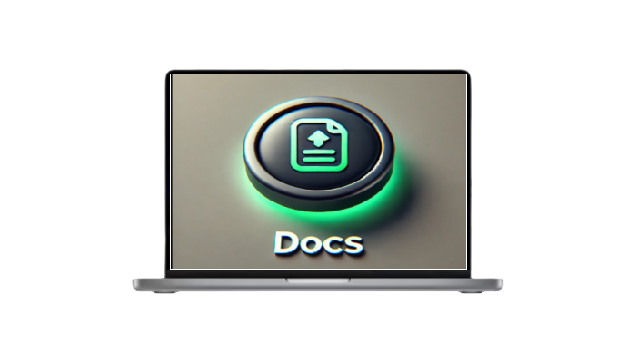
预览:
HTML
/* From Uiverse.io by barisdogansutcu */
<button class="download-button">
  <div class="docs">
    <svg
      viewBox="0 0 24 24"
      width="20"
      height="20"
      stroke="currentColor"
      stroke-width="2"
      fill="none"
      stroke-linecap="round"
      stroke-linejoin="round"
      class="css-i6dzq1"
    >
      <path
        d="M14 2H6a2 2 0 0 0-2 2v16a2 2 0 0 0 2 2h12a2 2 0 0 0 2-2V8z"
      ></path>
      <polyline points="14 2 14 8 20 8"></polyline>
      <line x1="16" y1="13" x2="8" y2="13"></line>
      <line x1="16" y1="17" x2="8" y2="17"></line>
      <polyline points="10 9 9 9 8 9"></polyline>
    </svg>
    Docs
  </div>
  <div class="download">
    <svg
      viewBox="0 0 24 24"
      width="24"
      height="24"
      stroke="currentColor"
      stroke-width="2"
      fill="none"
      stroke-linecap="round"
      stroke-linejoin="round"
      class="css-i6dzq1"
    >
      <path d="M21 15v4a2 2 0 0 1-2 2H5a2 2 0 0 1-2-2v-4"></path>
      <polyline points="7 10 12 15 17 10"></polyline>
      <line x1="12" y1="15" x2="12" y2="3"></line>
    </svg>
  </div>
</button>
CSS
代码解析:
HTML部分
主结构
<button class="download-button">
  <div class="docs">
    <!-- 图标和文字显示区域 -->
    <svg>...</svg>
    Docs
  </div>
  <div class="download">
    <!-- 图标显示区域 -->
    <svg>...</svg>
  </div>
</button>
button.download-button: 整个按钮的容器。div.docs: 按钮的主要显示区域,包含“文档”图标和文本“Docs”。div.download: 按钮的隐藏区域,在悬停时可见,显示绿色的“下载”图标。
CSS部分
样式和动画效果
1.整体按钮样式 (.download-button)
.download-button {
  position: relative;
  border-width: 0;
  color: white;
  font-size: 15px;
  font-weight: 600;
  cursor: pointer;
  border-radius: 4px;
  z-index: 1;
}
position: relative: 为内部绝对定位的子元素提供参考。border-radius: 圆角效果。z-index: 1: 确保按钮的主要内容层级较高。
2.主显示区域 (.docs)
.docs {
  display: flex;
  align-items: center;
  justify-content: space-between;
  gap: 10px;
  min-height: 40px;
  padding: 0 10px;
  background-color: #242a35;
  border: solid 1px #e8e8e82d;
  transition: all 0.5s cubic-bezier(0.77, 0, 0.175, 1);
}
display: flex: 使用弹性盒子布局,方便内容排列。background-color: #242a35: 背景为深灰色。transition: 平滑过渡效果,应用于悬停时的变化。
3.悬停效果 (.download-button:hover)
.download-button:hover {
  box-shadow:
    rgba(0, 0, 0, 0.25) 0px 54px 55px,
    rgba(0, 0, 0, 0.12) 0px -12px 30px,
    rgba(0, 0, 0, 0.12) 0px 4px 6px,
    rgba(0, 0, 0, 0.17) 0px 12px 13px,
    rgba(0, 0, 0, 0.09) 0px -3px 5px;
}
- 增加多个阴影效果,提升视觉层次感。
4. 隐藏的下载区域 (.download)
.download {
  position: absolute;
  inset: 0;
  display: flex;
  align-items: center;
  justify-content: center;
  transform: translateY(0%);
  background-color: #01e056;
  border: solid 1px #01e0572d;
  transition: all 0.5s cubic-bezier(0.77, 0, 0.175, 1);
}
position: absolute: 相对于.download-button定位。transform: translateY(0%): 初始位置在父容器内。background-color: #01e056: 绿色背景。z-index: -1: 默认隐藏在主显示区域下面。
5.悬停时动画
.download-button:hover .download {
  transform: translateY(100%);
}
- 悬停时,通过
transform将隐藏区域下滑,呈现下载内容。
6. 下载区域动画 (@keyframes docs)
@keyframes docs {
  0%, 100% { transform: translateY(0%); }
  50% { transform: translateY(-15%); }
}
- 控制
download中的图标上下摆动效果,增加活跃感。
© 版权声明
转载请注明出处
本网站名称:三理博客
本站永久网址:www.hs3l.com
本站资源仅供学习和交流使用,版权归原作者所有,请在下载后24小时之内自觉删除。
若作商业用途,请购买正版,由于未及时购买和付费发生的侵权行为,使用者自行承担,概与本站无关。
本网站名称:三理博客
本站永久网址:www.hs3l.com
本站资源仅供学习和交流使用,版权归原作者所有,请在下载后24小时之内自觉删除。
若作商业用途,请购买正版,由于未及时购买和付费发生的侵权行为,使用者自行承担,概与本站无关。
THE END


a188559875 4个月前0
路过一下,我只是来打酱油的!a1980166854 6个月前0
路过一下,我只是来打酱油的!a1980166854 6个月前0
楼主听话,快到碗里来!ly544251999 8个月前0
谢谢你的分享,我从中学到了很多!qiman 8个月前0
水帖美如花,养护靠大家!lunhui888 9个月前0
水帖美如花,养护靠大家!2nic5prhbh 9个月前0
教程很好用,谢谢!老冯
9个月前0
好东西,学习一下!