


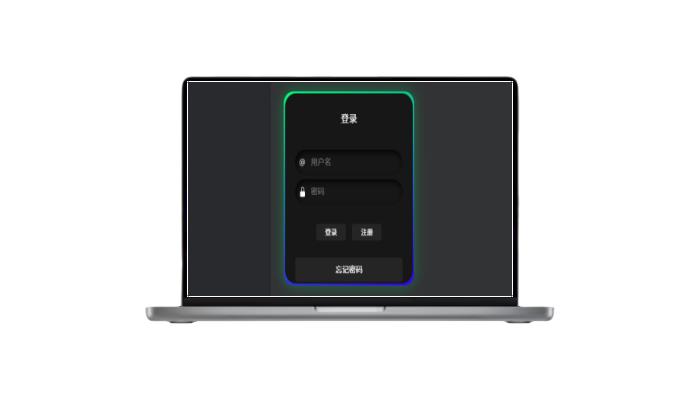
预览:
建议调成暗黑模式下预览
HTML
/* From Uiverse.io by yashasvi9199 */
<div class="card">
  <div class="card2">
    <form class="form">
      <p id="heading">Login</p>
      <div class="field">
        <svg
          viewBox="0 0 16 16"
          fill="currentColor"
          height="16"
          width="16"
          xmlns="http://www.w3.org/2000/svg"
          class="input-icon"
        >
          <path
            d="M13.106 7.222c0-2.967-2.249-5.032-5.482-5.032-3.35 0-5.646 2.318-5.646 5.702 0 3.493 2.235 5.708 5.762 5.708.862 0 1.689-.123 2.304-.335v-.862c-.43.199-1.354.328-2.29.328-2.926 0-4.813-1.88-4.813-4.798 0-2.844 1.921-4.881 4.594-4.881 2.735 0 4.608 1.688 4.608 4.156 0 1.682-.554 2.769-1.416 2.769-.492 0-.772-.28-.772-.76V5.206H8.923v.834h-.11c-.266-.595-.881-.964-1.6-.964-1.4 0-2.378 1.162-2.378 2.823 0 1.737.957 2.906 2.379 2.906.8 0 1.415-.39 1.709-1.087h.11c.081.67.703 1.148 1.503 1.148 1.572 0 2.57-1.415 2.57-3.643zm-7.177.704c0-1.197.54-1.907 1.456-1.907.93 0 1.524.738 1.524 1.907S8.308 9.84 7.371 9.84c-.895 0-1.442-.725-1.442-1.914z"
          ></path>
        </svg>
        <input
          type="text"
          class="input-field"
          placeholder="Username"
          autocomplete="off"
        />
      </div>
      <div class="field">
        <svg
          viewBox="0 0 16 16"
          fill="currentColor"
          height="16"
          width="16"
          xmlns="http://www.w3.org/2000/svg"
          class="input-icon"
        >
          <path
            d="M8 1a2 2 0 0 1 2 2v4H6V3a2 2 0 0 1 2-2zm3 6V3a3 3 0 0 0-6 0v4a2 2 0 0 0-2 2v5a2 2 0 0 0 2 2h6a2 2 0 0 0 2-2V9a2 2 0 0 0-2-2z"
          ></path>
        </svg>
        <input type="password" class="input-field" placeholder="Password" />
      </div>
      <div class="btn">
        <button class="button1">
                Login
        </button>
        <button class="button2">Sign Up</button>
      </div>
      <button class="button3">Forgot Password</button>
    </form>
  </div>
</div>
CSS
代码解析
HTML 部分:
- 整体结构:
<div class="card">
  <div class="card2">
    <form class="form">
      <p id="heading">Login</p>
      <div class="field">
        <svg>...</svg>
        <input type="text" class="input-field" placeholder="Username" />
      </div>
      <div class="field">
        <svg>...</svg>
        <input type="password" class="input-field" placeholder="Password" />
      </div>
      <div class="btn">
        <button class="button1">Login</button>
        <button class="button2">Sign Up</button>
      </div>
      <button class="button3">Forgot Password</button>
    </form>
  </div>
</div>
<div class="card">: 包裹整个表单的容器,给表单应用背景渐变颜色。<div class="card2">: 表单的内层容器,用于实现点击效果和阴影。<form class="form">: 用于包裹所有表单输入元素和按钮。<p id="heading">Login</p>: 表单的标题,内容为“登录”。- 输入框:包含两个输入框,一个用于用户名 (
<input type="text">),一个用于密码 (<input type="password">)。 - 按钮:
<button class="button1">Login</button>: 登录按钮。<button class="button2">Sign Up</button>: 注册按钮。<button class="button3">Forgot Password</button>: 忘记密码按钮。
CSS 部分:
.form:- 该类定义了表单元素的基本布局。
display: flex; flex-direction: column;:使用 Flexbox 布局,并将所有元素排列成垂直方向。gap: 10px;:为表单元素之间设置间距。padding-left: 2em; padding-right: 2em; padding-bottom: 0.4em;:为表单内内容提供内边距。background-color: #171717;:背景色设置为深灰色。border-radius: 25px;:圆角边框。
.card:- 该类定义了卡片容器的背景样式。
background-image: linear-gradient(163deg, #00ff75 0%, #3700ff 100%);:背景设置为从绿色到紫色的渐变色。border-radius: 22px;:卡片的圆角边框。transition: all 0.3s;:卡片元素在悬停时有平滑的过渡效果。
.card2:- 这是内层的容器,用来应用不同的过渡效果。
border-radius: 0;:没有圆角,直角。transition: all 0.2s;:用于平滑过渡效果。transform: scale(0.98);:在悬停时缩小卡片的大小,模拟点击效果。
.field:- 用于输入框的布局。
display: flex; align-items: center; justify-content: center; gap: 0.5em;:使用 Flexbox 排列图标和输入框。border-radius: 25px; padding: 0.6em;:圆角和内边距设置,确保输入框美观。background-color: #171717; box-shadow: inset 2px 5px 10px rgb(5, 5, 5);:深灰色背景,内阴影效果。color: white;:文本颜色为白色。
.input-icon:- 设置输入框内图标的大小。
height: 1.3em; width: 1.3em; fill: white;:图标的高度和宽度为 1.3em,并且颜色为白色。
.input-field:- 输入框的样式。
background: none; border: none; outline: none; width: 100%; color: #d3d3d3;:去掉边框和背景,宽度设置为 100%,文本颜色为浅灰色。
.btn:- 定义按钮容器的布局。
display: flex; justify-content: center; flex-direction: row;:使用 Flexbox 来水平排列按钮。margin-top: 2.5em;:按钮容器上边距设置,确保按钮不会靠得太近。
- 按钮样式:
.button1:登录按钮的样式。padding: 0.5em; padding-left: 1.1em; padding-right: 1.1em;:按钮内边距,使按钮更宽。background-color: #252525; color: white;:深灰色背景,白色文本。transition: 0.4s ease-in-out;:平滑过渡效果。:hover伪类:鼠标悬停时,背景色变为黑色,文本颜色保持白色。
.button2:注册按钮的样式,和登录按钮类似,但内边距较大,按钮宽度稍大。.button3:忘记密码按钮的样式。margin-bottom: 3em;:为按钮增加下边距,确保与底部内容有一定间距。background-color: #252525; color: white;:和其他按钮相同的背景颜色。:hover伪类:鼠标悬停时,背景色变为红色,文本颜色保持白色。
© 版权声明
转载请注明出处
本网站名称:三理博客
本站永久网址:www.hs3l.com
本站资源仅供学习和交流使用,版权归原作者所有,请在下载后24小时之内自觉删除。
若作商业用途,请购买正版,由于未及时购买和付费发生的侵权行为,使用者自行承担,概与本站无关。
本网站名称:三理博客
本站永久网址:www.hs3l.com
本站资源仅供学习和交流使用,版权归原作者所有,请在下载后24小时之内自觉删除。
若作商业用途,请购买正版,由于未及时购买和付费发生的侵权行为,使用者自行承担,概与本站无关。
THE END


a188559875 4个月前0
路过一下,我只是来打酱油的!a1980166854 6个月前0
路过一下,我只是来打酱油的!a1980166854 6个月前0
楼主听话,快到碗里来!ly544251999 8个月前0
谢谢你的分享,我从中学到了很多!qiman 8个月前0
水帖美如花,养护靠大家!lunhui888 9个月前0
水帖美如花,养护靠大家!2nic5prhbh 9个月前0
教程很好用,谢谢!老冯
9个月前0
好东西,学习一下!